• PROBLEM
Users left before they even understood the app's value
We expected users to sign up and explore, but most users dropped off before seeing the product's value.
• USER INTERVIEWS
Users confirmed onboarding wasn't clear and blocked management
"I kept resending the email verification because it wasn't coming through. I must have tried at least seven times. Eventually, I gave up. Then, 20 minutes later, I got all seven emails at once."

"I didn't get why I had to enter a PIN code. There were so many security checks and it felt unnecessary. It was all a bit over the top in my opinion."

"When I finished signing up, I had no idea what to do. Someone gave me a quick explanation, but there were so many layers to it that I just felt lost and unsure how to navigate anything."

We mapped the onboarding journey to nail down every drop off point
Email verification delays and no early value blocked users before they even saw what the app could do. Mapping the onboarding flow revealed exactly where friction spiked and why users left.

Image
Old Flow: Long email delays and no upfront value led to early drop off
Here's when it clicked:
The biggest drop off came from the very first thing we asked users to do.
Users came to start a challenge, not verify an email or create a club they didn't understand.
We flipped the flow, showing the challenge first and personal details later. Users saw value upfront, trust grew, and friction dropped.

Image
New flow: Value first, friction later. Users saw what they came for before entering personal info.
CHALLENGE
How do we make onboarding fun, engaging, and intuitive without overwhelming new users?
We turned user frustrations into three actionable redesign opportunties
Pain points
How might we…
Email verification delays
Users had to resend email verification multiple times leading to drop off.
How might we make verification fast and seamless to reduce drop off?
Too many security steps
Extra PIN checks felt unnecessary and discouraged users to keep going.
How might we simplify security without compromising safety?
No guidance after sign up
Users felt lost navigating the app post sign up.
How might we provide an engaging introduction that helps users navigate the app with confidence?
We knew what users wanted. These goals made sure they got it.
Onboarding process


First time user experience process
Final design
Start with the value, then raise the stakes.
Users from our marketing campaigns (driven by micro-influencers and established clubs) arrived ready to join a specific challenge. We let them enter a referral code or sign in right away, skipping cold sign-up.
Once the code was entered, they were taken straight to the club they came for, instantly delivering value and increasing conversion.
Video
Join your challenge instantly with a referral code
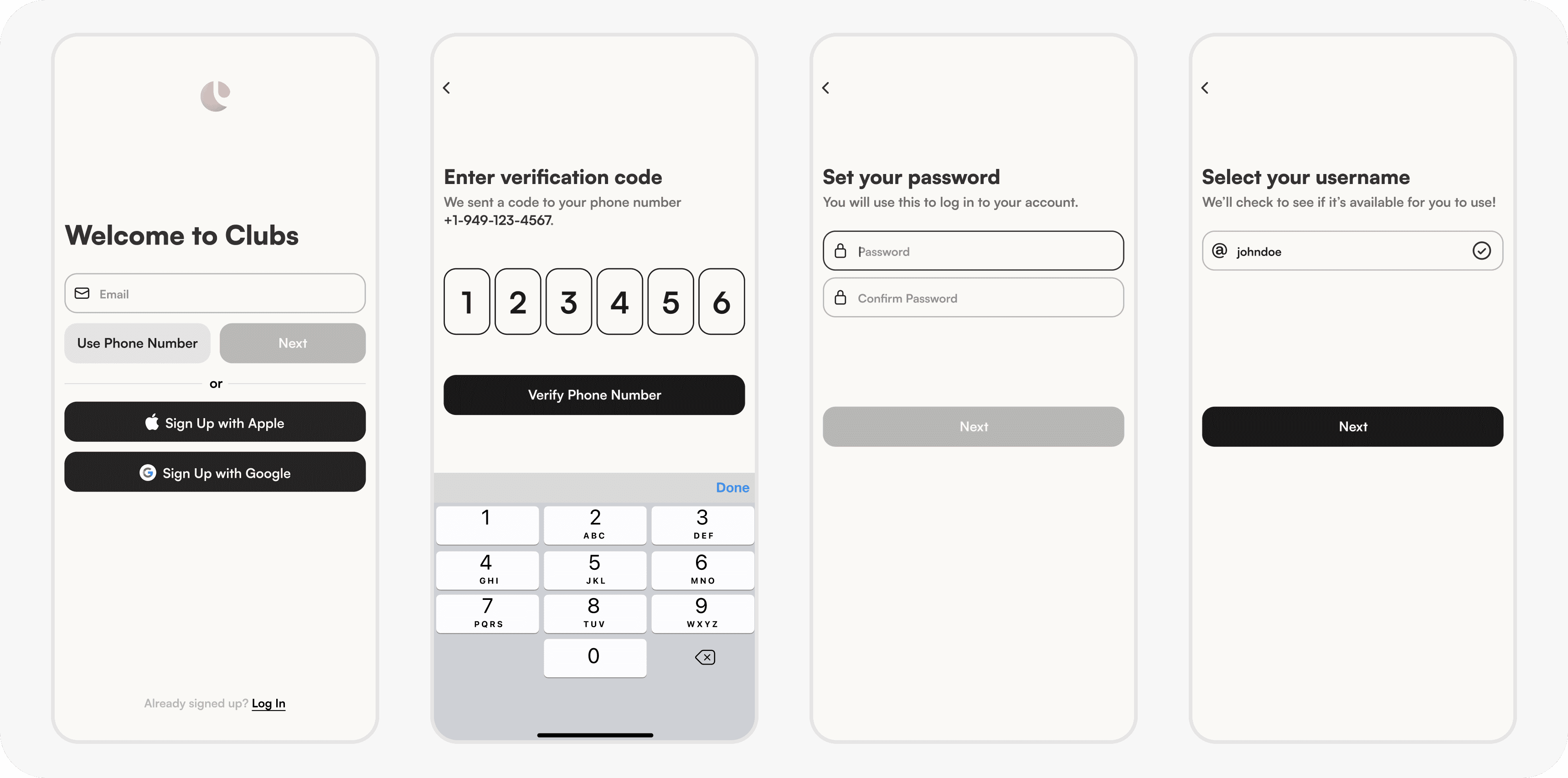
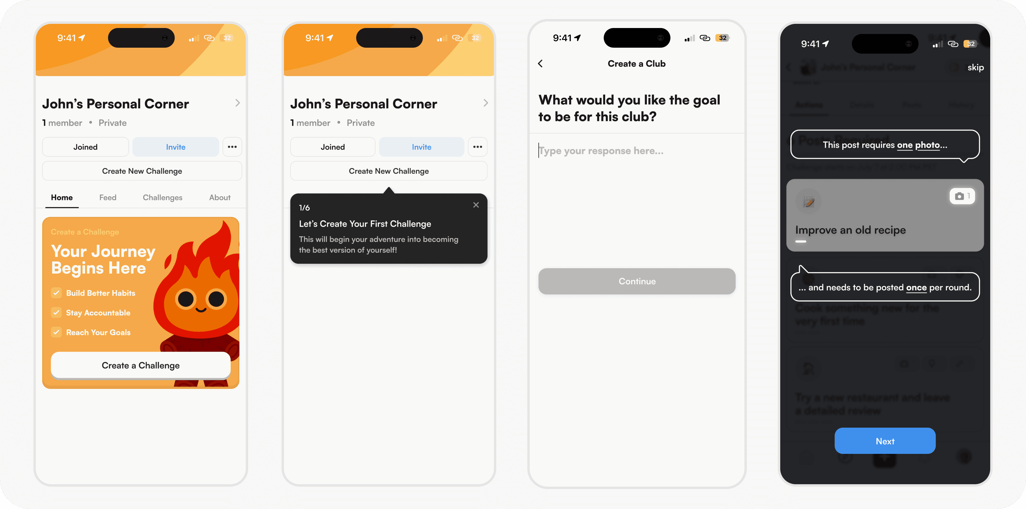
Verify via text, not the inbox.
Verification was a major drop-off point in our old flow. We swapped slow, clunky email for a frictionless SMS verification, cutting confusion and saving time.

Photo
Enter your number to start, no email required
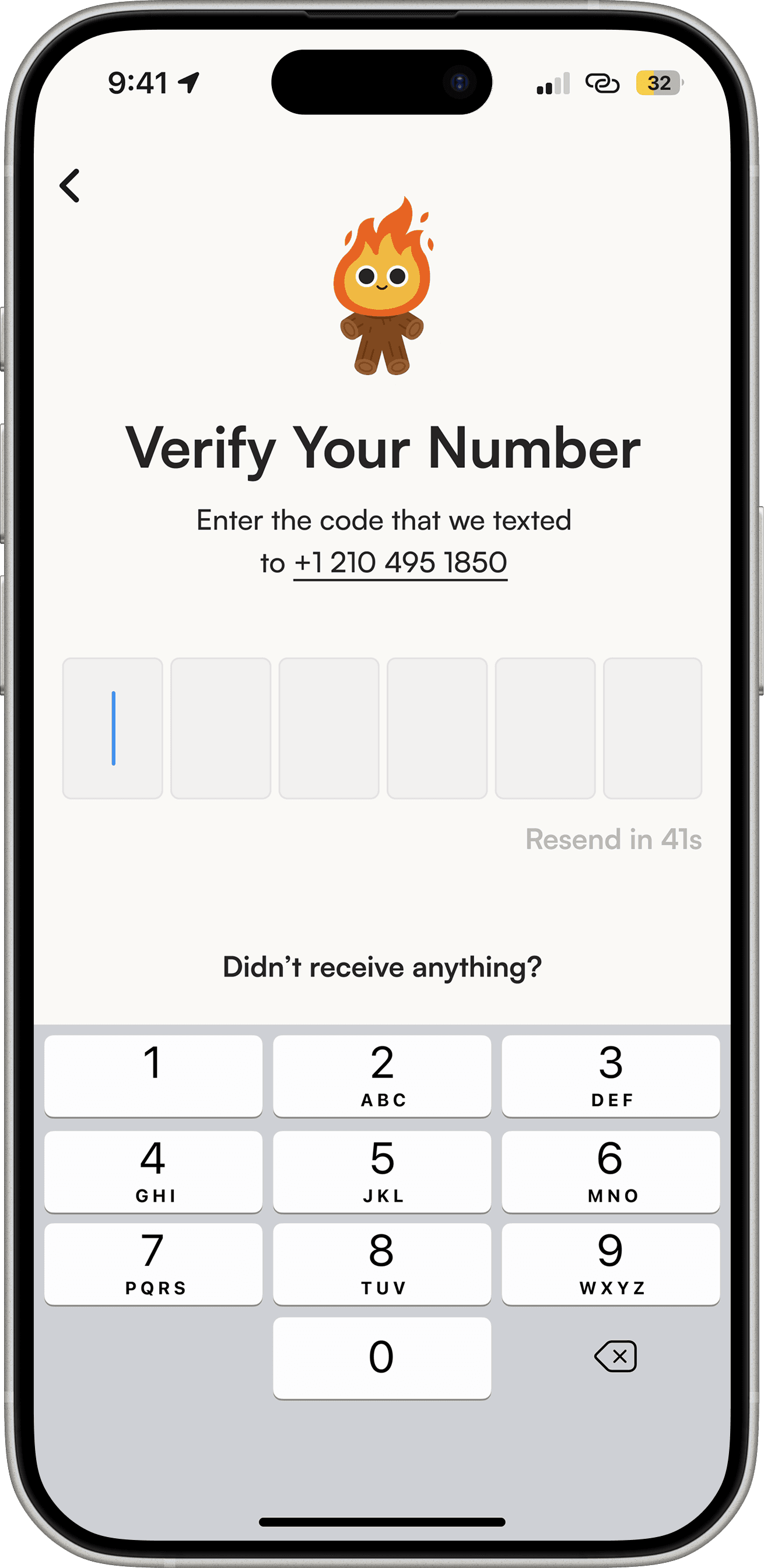
Photo
Verify instantly with a quick SMS code
Auto create a club, then guide the first challenge.
Every new user now gets a personal club the moment they join. From there, we guide them through creating their first challenge, explaining each step so they can start goal setting with confidence.
Video
From instant club creation to your first challenge, step by step
Post your first proof, hands on.
We built an interactive walkthrough that doesn’t just tell users how to post, it has them actually do it. We guide them through creating their first proof in real time.
Video
An interactive guide that walks you through posting and lets you try it yourself
• TAKEAWAYS
The onboarding is still in development, but these lessons are already shaping how I design.
Lead with clarity before complexity
I learned that introducing security or technical hurdles too early can hurt trust and adoption. Designing flows that build understanding first makes users more willing to engage with higher friction steps later.
Design is as much about restraint as creativity
Some iterations looked polished but didn't serve the user's journey. Stripping away extra steps and features made the product feel more intentional and helped users reach value faster.
Testing beats assumptions
Ideas that looked great in Figma didn't always translate in the real thing. Watching users interact with the product uncovered friction points I would've missed otherwise and made the final design far stronger.
Check out my other work!